Interim Case Study website.
You heard that right, I'm working on updating my case study page on my new site but in the meantime, you can see past work here on this site. Thanks for your patience.
Meta (Formerly Facebook)
Facebook, Instagram, WhatsApp. Surely you've used one of these apps so you kind of already know what goes on but, trust me it's a lot of work.
Ox For Zoom
Don't go into a meeting thinking you're just going to remember everything. Let AI help you!
Feel Free Connections
Connecting Businesses with their patrons and vice versa through gamification.
Website Design
Web Design has probably been the most consistent practice I have held since I first began my career. It's just something that as a designer, you truly never really get away from. Here are a few of some client websites I had the privilege of designing and building from scratch.
Mobile Design
Mobile design comes in many forms, you have mobile design in response to websites that are responsive and then you have mobile design for applications that are specifically for mobile devices. The interaction is similar yet also very different. I have a keen sense of systematizing my designs to comply with the many factors and complexities of mobile-first designs. Here are a few mobile design projects that I've worked on in conjunction with other designers and engineers.
Ox for Zoom
Ox, Inc. | Zoom App, native | View App

tl;dr
As remote work made video meetings a default mode of collaboration, meeting fatigue and cognitive overload increased. We explored how an AI companion for Zoom could support participants in real time by listening to meetings and offering contextual suggestions, while intentionally minimizing distraction and preserving the natural flow of conversation.
Strategy & Problem Definition
In remote-first work environments, video meetings place a high cognitive burden on participants, requiring them to listen, process information, recall details, and respond thoughtfully in real time. As meeting volume increased, users struggled to retain key points and craft effective responses, particularly in customer-facing conversations. The challenge was to introduce AI-driven assistance that provided timely, relevant support without interrupting attention, disrupting social dynamics, or adding to meeting fatigue.

Following early analysis and team alignment, I translated the core concept into low-distraction product visuals that could be shared with potential users for validation. The initial designs focused on providing clear, contextual assistance during live meetings while remaining intentionally lightweight, ensuring the tool could support customer service agents without competing for their attention.


To ground the solution in real user needs, I facilitated a design workshop with cross-functional partners to map the challenges agents face during live calls, including information recall, response timing, and cognitive overload. Insights from these sessions directly informed feature direction and interaction patterns, helping us prioritize AI support that was relevant, timely, and usable in high-pressure conversations.These workshops led to rapid feature definition and the creation of simple wireframes that balanced clarity with restraint. Through iterative discussion, we refined these concepts into a minimal prototype that clearly communicated the product vision and enabled early feedback on how AI assistance could be integrated into meetings without increasing distraction or fatigue.

The result above was too complex based on some initial feedback from our customers. The learning curve and data gathering we found were more confusing than helpful. We built portions of this into the admin app.
Activities | Design thinking • User research • Competitive analysis • Focus group • KPI development • Persona development • Trend Analysis • Market research
Tradeoffs & Constraints
Balancing assistance with attention
The primary constraint was introducing AI support without increasing cognitive load during live meetings. We intentionally avoided real-time interruptions, alerts, or conversational takeovers, prioritizing subtle visual cues and glanceable information over proactive prompts.Relevance over completeness
Given the open-ended nature of live conversations, the AI could theoretically surface a wide range of information. We constrained early feature scope to only the most contextually relevant suggestions, favoring usefulness and trust over breadth.Speed versus accuracy
To remain helpful in live calls, suggestions needed to appear quickly. We accepted that early outputs might be directional rather than exhaustive, designing the UI to communicate confidence levels implicitly and encourage human judgment over blind acceptance.Prototype fidelity versus learning velocity
Rather than investing early in high-fidelity visuals or complex interactions, we prioritized low- to mid-fidelity prototypes that allowed us to test core assumptions quickly with users and iterate based on feedback.
Solution
We designed an AI companion that passively listened during live meetings and detected key words and phrases based on the context of the conversation. Using this real-time understanding, the system surfaced relevant, glanceable response suggestions that enabled users to reply quickly and confidently without breaking focus or searching through notes.To support continuity beyond the live call, meetings were recorded and transcribed in the background, allowing users to revisit conversations, review key moments, and reference AI-assisted insights after the meeting concluded. Together, these capabilities supported both in-the-moment decision-making and post-meeting follow-up, without adding friction to the live experience.
During the meeting a user was able to use the AI bot to detect specific words or phrases based on the actual scenario of which their call was about. And then throughout the meeting the suggested responses would help give the user a way to quickly and efficiently respond to their client without having to think of a response or shuffle through notes. In the backend the meetings were recorded and the transcripts were saved and could be accessed at any time which you will see next.
Activities | Content creation • Content strategy • Wireframing • Design Sprints • Focus Groups • Rapid Prototyping • Iterative design
How do we evaluate this data recorded from each meeting?
With all these recordings, what can you actually do with them? Well that was day 2 of our workshop, we asked ourselves what data would be relevant to dissect on a larger scale that would help educate the user about the call they just had? We looked at and designed a system that stored each meeting, that you could go back and rewatch, see the AI analyzed score based on different predetermined data points, view the transcripts, and even dig in deeper by cutting up each meeting into smaller moments. This was definitely a phased approach.
This is only a portion of all the work and iterations that went into building this out completely but I want to point out all of the different areas of action we could pull from each meeting and how intricate a user could dissect just one meeting to gain valuable information not only for their job now but to then train others, reference for later or share with their team. This phase of the concept is built but with limited functionality thus far as introducing everything in the beginning would have been far too overwhelming for a user and therefore not adopted. This also gave us a way to hear from the user what is working for them and what they'd like to see.
Activities | Content creation • Design strategy • Visual design • Web application design • Rapid Prototyping • Feature release planning
Content Liquidity, Story Creation
Instagram | mobile app, native
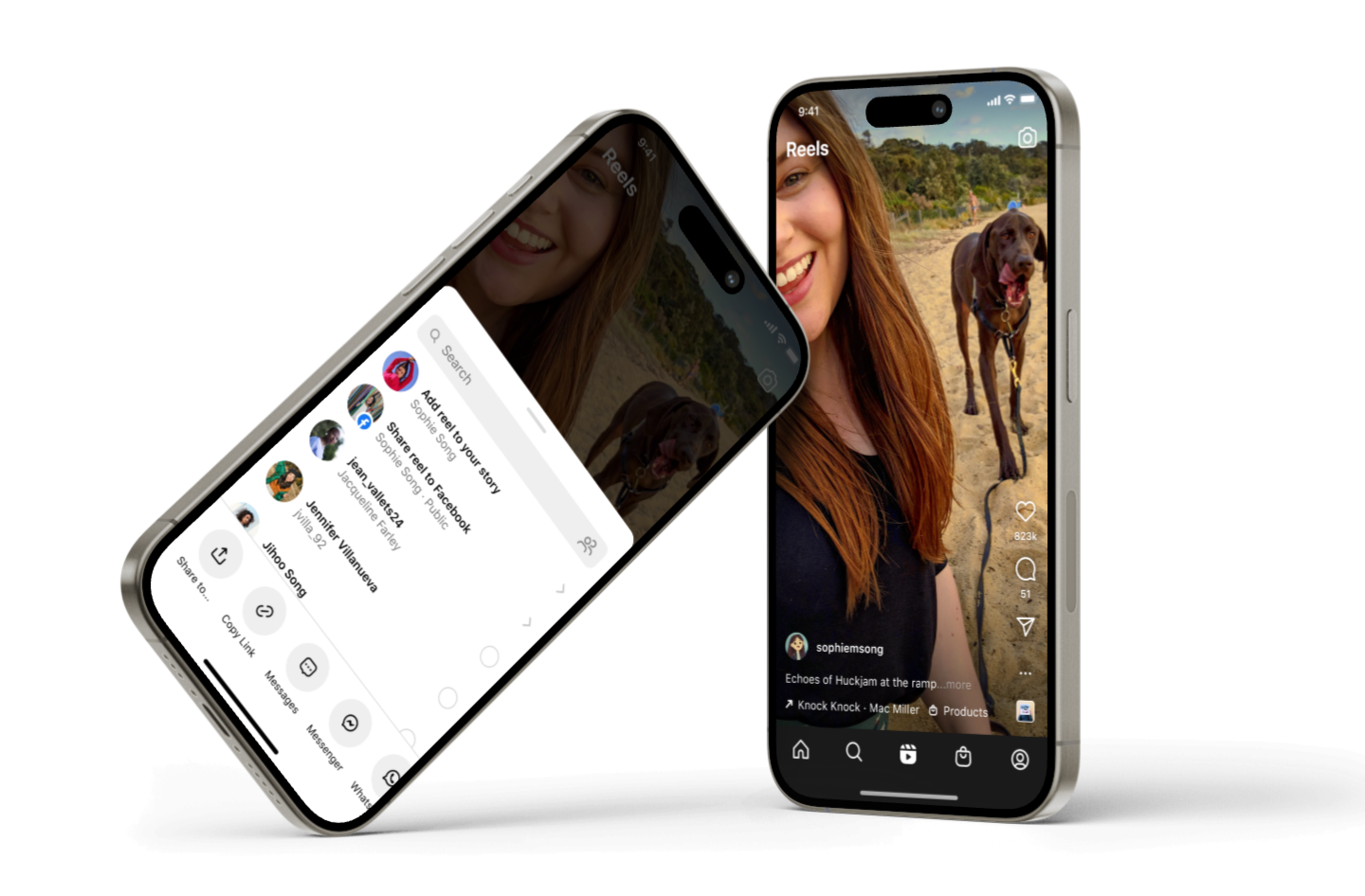
tl:dr
Following public scrutiny from a New York Times article, we identified a critical gap in user awareness around Instagram–Facebook Story cross-posting. As part of the Growth team, we rapidly shipped a targeted UX improvement that increased transparency and user control over account connections while minimizing disruption to existing sharing behavior.
Problem
Instagram users were unintentionally cross-posting Stories to Facebook due to unclear account-connection visibility and insufficient controls at the moment of sharing. This lack of explicit user awareness led to confusion, diminished trust, and reputational risk, highlighting a critical need to improve transparency and consent without negatively impacting growth or sharing velocity.

TASK
I wAs part of the Growth team, my task was to address a critical transparency gap in the Instagram Stories sharing flow, where users were unknowingly cross-posting content to connected Facebook accounts. The challenge was to make the account connection and sharing behavior explicit at the moment of action—without adding friction, slowing down sharing, or negatively impacting growth metrics.
OUTCOME
We shipped a subtle but high-impact UX update that surfaced Facebook cross-posting context directly within the Stories share flow, making the connection state and sharing behavior clear and actionable. This change improved user awareness and consent at the point of sharing, reduced confusion and trust risk highlighted by external press, and preserved existing sharing velocity by avoiding disruptive prompts or additional steps.
Activities | Content strategy • User testing • App research • Pattern discovery

RESULT
Through rapid iteration and close collaboration with content design and engineering, we introduced in-flow access to Account Center during the Stories creation and sharing process. This enabled users to clearly see and modify their Facebook sharing destination at the moment of intent, without requiring them to exit the creation flow or navigate to separate settings surfaces.By embedding account and sharing context directly within the flow and confirming changes through lightweight, time-bound feedback, we closed a critical gap between awareness and action. Users could make an informed, on-the-fly decision about cross-posting behavior, improving transparency and consent while preserving creation momentum and overall sharing velocity.
Activities | Interaction design • Design review • Rapid prototyping • Pattern discovery • Engineering
Additional Features
Once we were able to solve for the direct problem, there were still indirect effects and edge cases that began mounting up because of the broader experience of the app as a whole. More questions came about about other ways we need to provide clarity and transparency. I've captured a few of those design solutions below.


Here you'll see a series of small iterative design solutions centered around content liquidity that focuses on transparency around the destination of ones shared content. The idea was to test different mediums in which a user could be faced with wondering if they are sharing to their intended audience and cross-posted account, as well as how to change it, and turn certain upsells off, etc.
Activities | Interaction design • Design review • Rapid prototyping • Pattern discovery • Iterative design execution
Facebook Marketplace
Facebook Marketplace | Mobile app, native
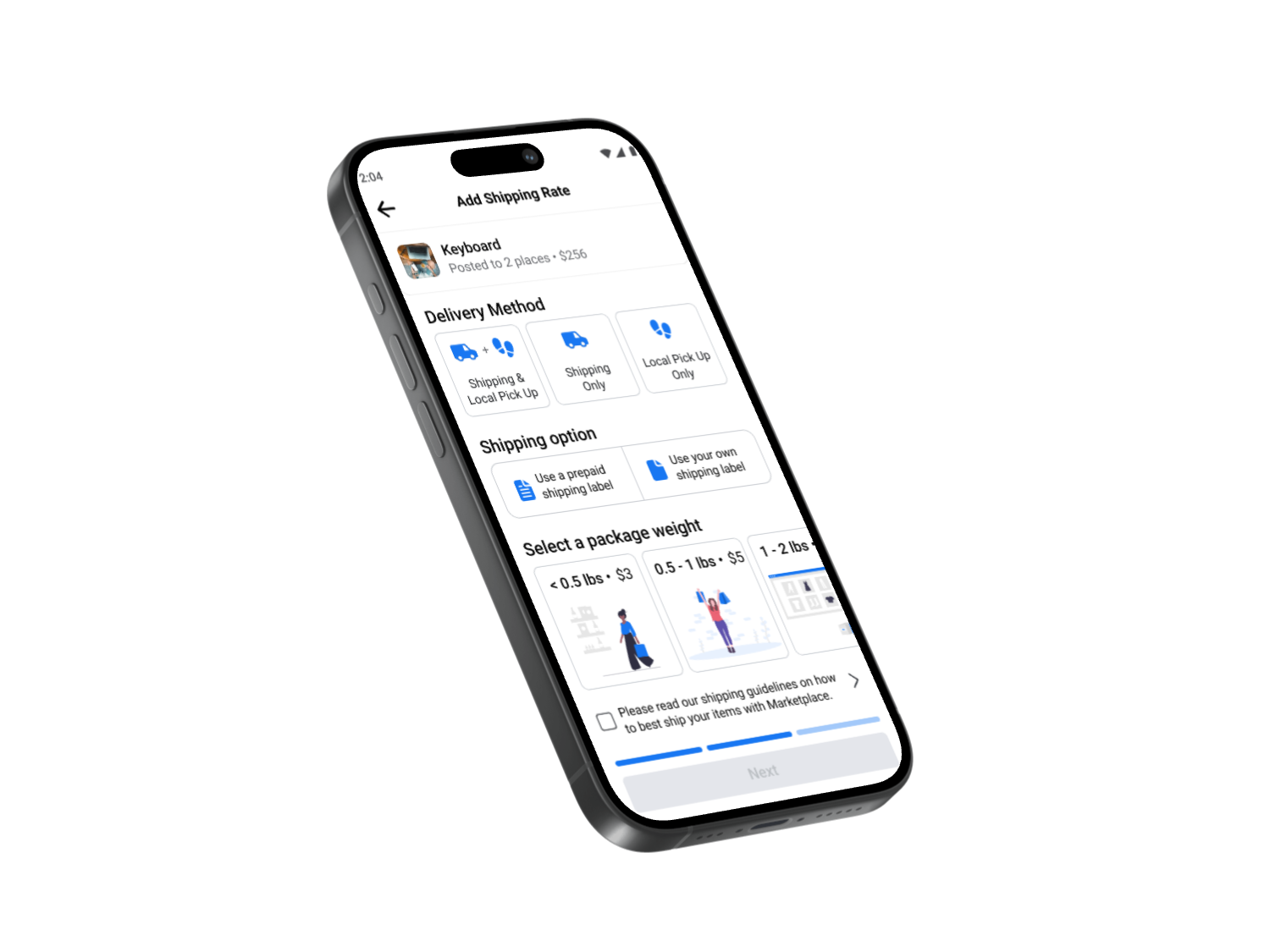
Problem
As you can see below the original experience was a list of dropdowns that would bring up a bottom sheet every time the user made a change. We wanted to be more efficient and it felt as though we weren't challenging ourselves in our visual design because of our extensive design system that is the go-to for all the visual cues throughout the app. But what if we combined our bold vision with another core value and that was to focus on impact.

In the effort of boldness I designed and iterated on a concept that cut the touchpoints in half by removing the drop-downs and bottom sheet drawers by way of replacing them with selective tab buttons that can easily be turned off/on and feels more app-like rather than operating like a mobile website. The challenge was not so much user-centric as it was working internally across teams and with the design systems team as a whole. Because these patterns were net new, there were a series of reviews we had to go through in order to test these tabbed buttons. The end result was positive but in the effort to make this change and introduce this new concept came at a high engineering cost and design systems cost that was not currently pushed as a priority into the backlog. It did achieve an eventual evaluation of how we can create better controls and visual cues to help a user ship their item faster.
Activities | User research • Cross-functional collaboration • Storyboarding • Design systems • Visual design • UI design
Solution
INTERACTIONS
It looks nice but is this something that will truly decrease amount of time a user is spending on the shipping set up? Well, I created an interactive prototype to prove how easy it was to tap a button on and off which gave the user much freedom when determining if this was truly a time-saver.

The above prototype helped mimic the user interactions that would take place during the "add shipping" process. To reduce time, the tabbed buttons made the most sense as long as there was accompanying context for each. The challenge was how much this would disrupt the design system. There were no other areas in the app where large tabular buttons were used. So this brought on a whole new set of patterns that had to go through a rigorous approval process. Even with my product manager and director on board, the design and tech investment in building these into the system where they may not ever be used anywhere else eventually became the deciding factor to not immediately build this feature. The good thing is that it started a discussion that led to more exploratory projects about how we can push the envelop with some of our systematized design structure.
Activities | Prototyping • Storytelling • Presentation design • Iterative design • Interaction design